
Contents
- Limit Text Input
- Barrel Files
- Don’t Push, Navigate
- Easy MediaQuery
- Global Message
- Hero Mode
- IconButton Constructors
- ListenableBuilder
- Loading Google Fonts
- Removing Page Transitions
- Using ValueNotifiers
- Pinned SliverHeader
- Spread Operator
- Staggered Animations
- Text Brightness
- Find the Current URL
Limit Text Input
User input == mass unpredictability.
People never behave how you expect them to and if your app isn’t prepared for this, the results can be ugly.
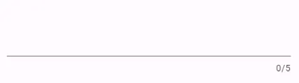
One way to restrict user input is to limit the number of characters they can enter in a TextField. For example, lets say you have a zip code field that users can use to search their location on a map. Zip codes are generally only 5 characters and anything more (or less) will likely caues your search feature to breakdown. You can cap the character limit on the zip code field by adding the maxLength property like this:
TextField(maxLength: 5),
This generates a simple TextField with a counter in the bottom right:
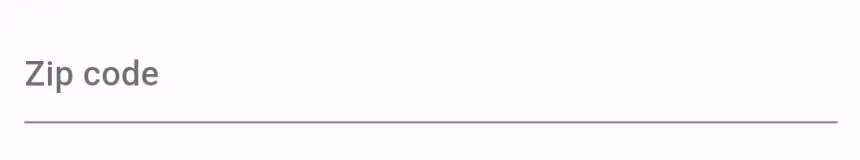
 But what if you don’t want to show a counter? After all, most people know that a zip code is 5 digits long. In that case, you can replace the
 counter property like this:
child: TextField(
  maxLength: 5,
  decoration: InputDecoration(
    hintText: 'Zip code',
    counter: SizedBox.shrink(),
  ),
),
This is a two-part solution. We can accomplish the same thing with one less step by using a LengthLimitingTextInputFormatter like this:
child: TextField(
        inputFormatters: [LengthLimitingTextInputFormatter(5)],
        decoration: const InputDecoration(hintText: 'Zip code'),
),
Who else likes code golf? ⛳️
Barrel Files
Creating one widget per dart file can drastically improve the overall organization of your Flutter project at the expense of increasing the total number of import statements required to compose your widget trees. To combat this downside, you can create what are know as “barrel files” to export multiple files from a single location. Files that need to use the same set of widgets can then import one barrel file instead of each separate widget file.
For instance, say you’re building an app meant to describe the nature of the universe and you’re frequently using 3 widgets: Reality, Simulation, and Nothing. On a page where you need all 3 widgets, you would typically import them like this:
import 'package:example/widgets/nothing.dart';
import 'package:example/widgets/reality.dart';
import 'package:example/widgets/simulation.dart';
To avoid doing this everywhere, you can instead create a fourth file in the same directory as these widgets called widgets.dart and export each of these widgets like this:
export 'nothing.dart';
export 'reality.dart';
export 'simulation.dart';
Now, wherever you need one, two, or three of these widgets, you can use a single import statement:
import 'package:example/widgets/widgets.dart';
You can install the[Dart Barrel File Generator plugins for VS code or Android Studio to automate the creation of these files, too.
Don’t Push, Navigate
Navigating through the pages of a Flutter web apps without spamming the console with errors requires a bit of finesse. Unlike native Android or iOS applications which manage a literal stack of routes or pages, web apps treat each route as a standalone page that can be accessed directly from a URL and refreshed ad nauseam. Further, pressing the back arrow in a browser doesn’t “pop” the top route off your stack - it pushes the previous route 🤔
With all of this in mind, its easy to see how you can wind up with errors on top of errors as multiple widgets with the same key pile onto your router.
How can you fix this?
There are multiple techniques you can employ but here I want to focus on the concept of “navigating to” routes instead of always pushing them onto your stack.
- If a route is already in your stack, pop until you get to it
- If the route is not in your stack, push it as you normally would
That’s it! By doing this, you can avoid having two of the same PostDetailsRoutes stacked on top of each other and simultaneously avoid elusive bugs. The go_router package is designed to use declarative routing so if you’re already using that, you might be fine. The auto_route package on the other hand is older and more open to imperative pushing and popping. Fortunately, it has a navigate() method that will pop to a page if its already in the stack and push it if not. Exactly what we want.
The base Flutter Navigator doesn’t let you view the current stack but you can use a custom NavigatorObserver to manually track the stack and then push or pop as appropriate.
List<Route<dynamic>> routeStack = [];

void navigate(BuildContext context, String routeName) {
  if (routeStack.map((e) => e.settings.name).contains(routeName)) {
    Navigator.of(context).popUntil((route) => route.settings.name == routeName);
    return;
  } else {
    Navigator.of(context).pushNamed(routeName);
  }
}

void printStack() {
  debugPrint('routeStack: ${routeStack.map((e) => e.settings.name)}');
}

class MyNavigatorObserver extends NavigatorObserver {
  @override
  void didPush(Route<dynamic> route, Route<dynamic>? previousRoute) {
    routeStack.add(route);
    printStack();
  }

  void didPop(Route<dynamic> route, Route<dynamic>? previousRoute) {
    routeStack.removeLast();
    printStack();
  }

  @override
  void didRemove(Route route, Route? previousRoute) {
    routeStack.removeLast();
    printStack();
  }

  @override
  void didReplace({Route? newRoute, Route? oldRoute}) {
    routeStack.removeLast();
    if (newRoute != null) routeStack.add(newRoute);
    printStack();
  }
}
Easy MediaQuery
The MediaQuery widget is an InheritedWidget (more specifically an InheritiedModel) that passes a MediaQueryData object to its subtree. This object includes information about the screen size, default insets, and accessibility data like the text scaling factor.
The MaterialApp class includes a MediaQuery widget at the root of your app’s widget tree. You typically access data from the nearest MediaQuery like this:
Size size = MediaQuery.of(context).size;
Conveniently, MediaQuery has a long list of static methods that can be used to access data in the nearest MediaQuery. Save yourself a bit of typing ✌️
Size size = MediaQuery.sizeOf(context);

EdgeInsets viewInsets = MediaQuery.viewInsetsOf(context);

EdgeInsets viewPadding = MediaQuery.viewPaddingOf(context);

double textScaleFactor = MediaQuery.textScaleFactorOf(context);

double devicePixelRatio = MediaQuery.devicePixelRatioOf(context);

Brightness brightness = MediaQuery.platformBrightnessOf(context);

bool alwaysUse24HourFormat = MediaQuery.alwaysUse24HourFormatOf(context);

bool boldTextScaleFactor = MediaQuery.boldTextOf(context);

bool accessibleNavigation = MediaQuery.accessibleNavigationOf(context);

bool invertColors = MediaQuery.invertColorsOf(context);

bool disableAnimations = MediaQuery.disableAnimationsOf(context);

bool highContrast = MediaQuery.highContrastOf(context);
Global Message
In some situations, you may want to display a message to your users regardless of where they are in your app. For example:
- A newer version of your app is available to download and you want users to update
- The app will be undergoing maintenance soon and you want to warn users that service will be unavailable
- You want to share a message about current events with your audience
To accomplish this, you can use the builder property on the MaterialApp class and the Stack widget to conditionally display an informational banner. First, you’ll need a way to determine if the user acknowledged the banner:
ValueNotifier<bool> acknowledgeGlobalMessage = ValueNotifier<bool>(false);
Then you can use that variable inside the builder of your MaterialApp:
return MaterialApp(
  debugShowCheckedModeBanner: false,
  builder: (context, child) {
    return ValueListenableBuilder<bool>(
        valueListenable: acknowledgeGlobalMessage,
        builder: (context, acknowledged, _) {
          return Stack(
            alignment: Alignment.center,
            children: [
              child ?? const SizedBox(),
              if (!acknowledged)
                Positioned(
                  top: MediaQuery.of(context).padding.top + kToolbarHeight,
                  right: 0,
                  left: 0,
                  child: Dismissible(
                    onDismissed: (_) {
                      acknowledgeGlobalMessage.value = true;
                    },
                    key: const Key('global_message'),
                    child: Material(
                      child: ListTile(
                        tileColor: Colors.blue,
                        title: const Text('There is a new version available!'),
                        trailing: TextButton(
                            onPressed: () {
                                // Update App
                            },
                            child: const Text(
                              'Update',
                              style: TextStyle(color: Colors.white),
                            )),
                      ),
                    ),
                  ),
                ),
            ],
          );
        });
  },
  home: const Question57069641(),
);
This banner will display on all screens in your app until the user dismisses it by swiping left or right or updating their app.
If you want to make the message fixed (so users can’t dismiss it), wrap the Dismissible in an IgnorePointer widget:
IgnorePointer(
  ignoring: true,
  child: Dismissible(
    ...
  ),
),
Tip inspired by Stack Overflow question 57069641
Hero Mode
The HeroMode widget can be used to programmatically enable or disable a hero animation.
To start, determine how you want to track if the Hero is enabled. It’s fairly easy to do this with a ValueNotifier:
ValueNotifier<bool> showAnimations = ValueNotifier(false);

void setShowAnimations(bool val) {
  showAnimations.value = val;
}
Then wrap the Hero you want to control in a HeroMode. In this example, I use a ValueListenableBuilder to bind the HeroMode to the showAnimations flag above:
ValueListenableBuilder(
        valueListenable: showAnimations,
        builder: (context, animate, _) {
          return Scaffold(
            appBar: AppBar(
              title: Text('HeroMode: $animate'),
              actions: [
                const Text('Animations'),
                Switch(
                  value: animate,
                  onChanged: (value) {
                    setShowAnimations(value);
                  },
                ),
              ],
            ),
            body: const Center(child: Text('Screen 1')),
            floatingActionButton: HeroMode(
              enabled: animate,
              child: FloatingActionButton(
                child: const Icon(Icons.arrow_forward),
                onPressed: () {
                  Navigator.push(
                    context,
                    MaterialPageRoute(builder: (context) => const Screen2()),
                  );
                },
              ),
            ),
          );
        });
This approach can be useful for implementing a setting in your app that allows users to turn off animations. Some folks don’t enjoy UI components flying across the screen and that’s fine.
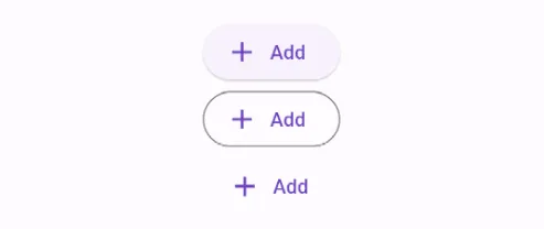
IconButton Constructors
Adding an icon to a Material button can give your design that extra shine. Luckily, each of the built in Material button types have a .icon constructor which you can use to tack on a leading icon:
Each of these constructors requires an “icon” and a “label” property.
Center(
  child: Column(
    children: [
      ElevatedButton.icon(onPressed: () {}, icon: const Icon(Icons.add), label: const Text('Add')),
      OutlinedButton.icon(onPressed: () {}, icon: const Icon(Icons.add), label: const Text('Add')),
      TextButton.icon(onPressed: () {}, icon: const Icon(Icons.add), label: const Text('Add')),
    ],
  ),
),
ListenableBuilder
The ListenableBuilder widget can be used to listen to any Listenable, including:
- TextEditingControllers
- ScrollControllers
- PagerControllers
- TabControllers
- ChangeNotifiers
The ListenableBuilder will rebuild everytime the Listenable changes so you can use it to enable a submission button when a TextField is populated or show an up arrow when the user hits the bottom of a scroll window:
Column(
  crossAxisAlignment: CrossAxisAlignment.stretch,
  children: [
    TextField(
      controller: controller,
    ),
    Padding(
      padding: const EdgeInsets.only(top: 16.0),
      child: ListenableBuilder(
        listenable: controller,
        builder: (context, child) {
          return ElevatedButton(
            onPressed: controller.text.isNotEmpty
                ? () {
                    ScaffoldMessenger.of(context).showSnackBar(
                      const SnackBar(
                        content: Text('Submitted!'),
                      ),
                    );
                  }
                : null,
            child: const Text('Submit'),
          );
        },
      ),
    ),
  ],
),
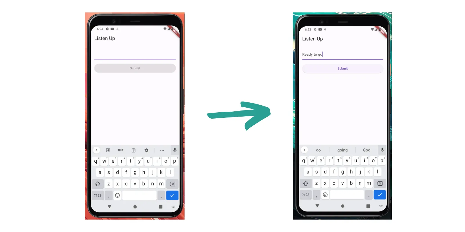
Loading Google Fonts
On Flutter web, the google_fonts package can take 100-300ms to load the text theme’s your app needs. During this time, Flutter will use the default text theme to render text. When the Google Font you need is loaded, the text is updated and it’s possible for your app’s layout to shift.
To avoid this, you can use the GoogleFonts.pendingFonts() method which was added in June, 2023. This method returns a future that resolves when the requested fonts are finished loading.
You can await all required fonts like this:
Future loadFonts = GoogleFonts.pendingFonts();
Or only a subset of fonts by specifying them in list format:
Future loadFonts = GoogleFonts.pendingFonts([GoogleFonts.poppins]);
This future can be plugged into a FutureBuilder to display the text only when the fonts are ready:
return FutureBuilder(
      future: googleFontsPending,
      builder: (context, snapshot) {
        bool isDone = snapshot.connectionState == ConnectionState.done;

        if (isDone) {
          if (!loaded) {
            WidgetsBinding.instance.addPostFrameCallback((timeStamp) {
              setState(() => loaded = true);
            });
          }
        }

        return AnimatedSwitcher(
          duration: const Duration(milliseconds: 300),
          child: loaded ? widget.child : SizedBox.fromSize(size: widget.size),
        );
      },
    );
Removing Page Transitions
Most modern day websites don’t animate from one page to the next like a mobile application. When a new page is loaded, it typically pops onto screen as soon as its loaded instead of sliding in from the left or scaling up from the center. It’s just how things work.
In Flutter, the default behavior is for new screens to animate into view using one of the popular PageTransitionsBuilders (ex CupertinoPageTransitionsBuilder, FadeUpwardsPageTransitionsBuilder, or the OpenUpwardsPageTransitionsBuilder). To completely remove this type of animation, you can create your own PageTransitions Builder.
import 'package:flutter/material.dart';

class NoTransitionsBuilder extends PageTransitionsBuilder {
  const NoTransitionsBuilder();

  @override
  Widget buildTransitions<T>(
      PageRoute<T>? route,
      BuildContext? context,
      Animation<double> animation,
      Animation<double> secondaryAnimation,
      Widget child,
      ) {
    // only return the child without warping it with animations
    return child;
  }
}
To use it, add it to your app’s theme like this:
MaterialApp.router(
    routerConfig: router.config(),
    theme: ThemeData(
      pageTransitionsTheme: PageTransitionsTheme(
        builders: kIsWeb
            ? {
                for (final platform in TargetPlatform.values) platform: const NoTransitionsBuilder(),
              }
            : {
                TargetPlatform.android: const ZoomPageTransitionsBuilder(),
                TargetPlatform.iOS: const CupertinoPageTransitionsBuilder(),
              },
      ),
    ),
  );
Using ValueNotifiers
ValueNotifiers are extremely useful for managing state in your Flutter application but they might not work how you’d expect them to.
From the docs 📘:
Because this class only notifies listeners when the value’s identity changes, listeners will not be notified when mutable state within the value itself changes.
This means that for some data types (custom classes, Lists, and Maps) listeners will only be notified if you change the identity of your value.
Lists
ValueNotifier<List<int>> data = ValueNotifier([]);

// Listeners NOT notified
void addDataMutable(int val) {
  data.value.add(val);
}

// Listeners notified
void addData(int val) {
  data.value = [...data.value, val];
}
Maps
ValueNotifier<Map<String, int>> map = ValueNotifier({});

// Listeners NOT notified
void addDataToMapMutable(String key, int val) {
  map.value[key] = val;
}

// Listeners notified
void addDataToMap(String key, int val) {
  map.value = {...map.value, key: val};
}
Custom Classes
ValueNotifier<Person> person = ValueNotifier(Person(
  name: 'Elon Musk',
  age: 52,
));

// Listeners notified
void setPersonName(String name) {
  person.value = Person(name: name, age: person.value.age);
}

// Listeners NOT notified
void setPersonNameMutable(String name) {
  person.value.name = name;
}
Updating the value inside a ValueNotifier directly without changing the value’s identity will still change the value. This can lead to some interesting bugs where the UI is out of date with the value in the ValueNotifier. To avoid this in the List and Map cases, you can construct your lists and maps using the List.unmodifiable and Map.unmodifiable constructors.
Pinned SliverHeader
Flutter 3.13 was released this week and it added a sweet new widget: SliverMainAxisGroup. This widget lets you group multiple sliver children in a list. The only way to do this before the 3.13 release was with the sliver_tools package (#RIP).
CustomScrollView(
      slivers: [
        SliverMainAxisGroup( // The new addition to the Widget family
          slivers: [
            const SliverAppBar(...),
            SliverList.builder(...),
            SliverToBoxAdapter(...)
          ],
        ),
        SliverToBoxAdapter(...),
      ],
    );
If you want to create a pinned header inside a CustomScrollView or SliverList, now you can easily do that. First, create a new class that extends SliverPersistentHeaderDelegate:
class HeaderDelegate extends SliverPersistentHeaderDelegate {
  const HeaderDelegate(this.child);

  final Widget child;

  @override
  Widget build(BuildContext context, double shrinkOffset, bool overlapsContent) {
    return child;
  }

  @override
  double get maxExtent => minExtent;

  @override
  double get minExtent => 48;

  @override
  bool shouldRebuild(covariant SliverPersistentHeaderDelegate oldDelegate) => false;
}
Then, add a SliverMainAxisGroup to your scrolling sliver widget (for example, CustomScrollView). Inside the SliverMainAxisGroup you can add a SliverPersistentHeader widget that uses the delegate you created above. Don’t forget to set pinned to true:
 return CustomScrollView(
            slivers: [
              SliverMainAxisGroup(slivers: [
                SliverToBoxAdapter(...),
                SliverPersistentHeader(
                  pinned: true, // Pin it!
                  floating: false,
                  delegate: HeaderDelegate( // Your custom delegate
                      Material(
                        color: Colors.white,
                        child: ListTile(
                          tileColor: Colors.white,

                          title: Text('We pinned'),),
                      )
                  ),),
                SliverList.builder(...)
              ]),
              SliverToBoxAdapter(...),
              SliverToBoxAdapter(...),
            ],
          );
When the SliverPersistentHeader reaches the top of the screen, it will stick until the entire SliverMainAxisGroup is scrolled through.
You can accomplish a similar effect by adding a SliverAppBar to the SliverMainAxisGroup but note that this widget will behave like an AppBar with a leading icon, scrolled under color change, and default size.
 return CustomScrollView(
            slivers: [
              SliverMainAxisGroup(slivers: [
                SliverToBoxAdapter(...),
                SliverAppBar(
                  pinned: true,
                  title: Text('Pinned'),
                ),
                SliverList.builder(...)
              ]),
              SliverToBoxAdapter(...),
              SliverToBoxAdapter(...),
            ],
          );
Spread Operator
Adding or removing multiple widgets from a Row or Column is frequently a requirement in many Flutter applications. Use the Spread Operator (…) to group several widgets and show or hide them based on a condition.
Column(
  children: [
    ListTile(title: Text('Always Show')),
    if(showMaybe)...[
      ListTile(title: Text('Maybe Show 1')),
      ListTile(title: Text('Maybe Show 2')),
      ListTile(title: Text('Maybe Show 3')),
    ]
  ]
)
The spread operator can be used inside of any widget that accepts a list of children, including Rows, Columns, ListViews, and GridViews. You can also use it in lists that are not related to your app’s UI.
Staggered Animations
One of the oldest UI tricks in the book is to stagger your entry animations so the components on screen roll or pop in one after the other. You can accomplish this easily using the flutter_animate package and the “delay” property on the Animate widget:
@override
  Widget build(BuildContext context) {
    return Scaffold(
      appBar: AppBar(title: const Text('Staggered Animations Tip')),
      body: ListView.builder(
        itemBuilder: (context, index) {
          return Animate(
            effects: const [ScaleEffect(begin: Offset(0.8, 0.8))],
            delay: Duration(milliseconds: 100 * index), // Use the index value to stagger
            child: ListTile(
              title: Text('Item $index'),
              subtitle: Text('Subtitle $index'),
              leading: CircleAvatar(child: Text('$index')),
              trailing: const Icon(Icons.arrow_forward_ios),
            ),
          );
        },
      ),
    );
  }
The key here is to use the index property from your ListView.builder to make each item take just a little longer to show up.
What’s the catch?
For small lists, the approach above is fine. For larger lists, when the index value might be 10, 20, or a 100 times larger than what can appear on the screen at one time, items towards the bottom of the list will take forever to animate in.
To fix this, use the min function from the dart:math library to cap the delay at a certain value (typically a number that fits nicely on screen).
@override
  Widget build(BuildContext context) {
    return Scaffold(
      appBar: AppBar(title: const Text('Staggered Animations Tip')),
      body: ListView.builder(
        itemBuilder: (context, index) {
          return Animate(
            effects: const [ScaleEffect(begin: Offset(0.8, 0.8))],
            delay: Duration(milliseconds: 100 * min(index, 8)), // use min to cap the delay
            child: ListTile(
              title: Text('Item $index'),
              subtitle: Text('Subtitle $index'),
              leading: CircleAvatar(child: Text('$index')),
              trailing: const Icon(Icons.arrow_forward_ios),
            ),
          );
        },
      ),
    );
  }
You can see examples of each of these code snippets in this Tweet.
Text Brightness
You can determine the relative brightness of a color in Flutter two ways.
computeLuminance
Call the computeLuminance method on your color to get a value between 0 (dark) and 1 (light). You can update the color of text on top of this background based on your preferred threshold.
ColoredBox(
  color: Colors.red,
  child: Text(
    'Text on Colors.red',
    style: TextStyle(
      color: Colors.red.computeLuminance() > 0.5 ? Colors.black : Colors.white,
    ),
  ),
),
estimateBrightnessForColor
Use ThemeData’s static estimateBrightnessForColor method to determine if a color is considered “light” or “dark” according to the Material design specifications.
bool isLight(Color color) => ThemeData.estimateBrightnessForColor(color) == Brightness.light;

 ColoredBox(
   color: blue,
   child: Text(
     'Text on Colors.blue',
     style: TextStyle(
       color: isLight(Colors.blue) ? Colors.black : Colors.white,
     ),
   ),
 ),
Find the Current URL
There are situations while developing a Flutter web app when knowing the current URL is beneficial. For example, maybe you want to know if the user is on the home page or if they are inside of a certain workflow. This is straightforward using the Uri class in Flutter.
Anywhere within your application, simply access the Uri.base property.
From the docs 📘
The natural base URI for the current platform.
When running in a browser, this is the current URL of the current page (from window.location.href).
When not running in a browser, this is the file URI referencing the current working directory.
The Uri.base proprty contains all data relevant to the current URL:
ValueNotifier<Uri?> uri = ValueNotifier(null);

void setUri(Uri val) {
  uri.value = val;
}

class UriButton extends StatelessWidget {
  const UriButton({Key? key}) : super(key: key);

  @override
  Widget build(BuildContext context) {
    return OutlinedButton(
        onPressed: () {
          setUri(Uri.base);
          print('base: ${Uri.base}');
          print('path: ${Uri.base.path}');
          print('query parameters: ${Uri.base.queryParameters}');
          print('fragments: ${Uri.base.fragment}');
          print('origin: ${Uri.base.origin}');
          print('scheme: ${Uri.base.scheme}');
          print('userInfo: ${Uri.base.userInfo}');
          print('host: ${Uri.base.host}');
          print('port: ${Uri.base.port}');
          print('hasAuthority: ${Uri.base.hasAuthority}');
          print('hasEmptyPath: ${Uri.base.hasEmptyPath}');
          print('hasFragment: ${Uri.base.hasFragment}');
          print('hasPort: ${Uri.base.hasPort}');``
          print('hasQuery: ${Uri.base.hasQuery}');
          print('hasScheme: ${Uri.base.hasScheme}');
          print('isAbsolute: ${Uri.base.isAbsolute}');
          print('queryParametersAll: ${Uri.base.queryParametersAll}');
          print('userInfo: ${Uri.base.userInfo}');
          showModalBottomSheet(context: context,

            constraints: BoxConstraints(maxHeight: 700),
            builder:  (context) {
            return ColoredBox(color: Theme.of(context).colorScheme.secondary,
            child: ValueListenableBuilder(
                valueListenable: uri,
                builder: (context, value, child) {
                  if (value != null) {
                    return Theme(
                      data: ThemeData(
                        listTileTheme: const ListTileThemeData(
                          tileColor: Colors.white,
                          dense: true,contentPadding: EdgeInsets.all(0)
                        ),
                      ),
                      child: ListView(
                        children: [
                          ListTile(title: Text('Uri.base: $value')),
                          ListTile(title: Text('Uri.base.path: ${value.path}')),
                          ListTile(title: Text('Uri.base.queryParameters: ${value.queryParameters}')),
                          ListTile(title: Text('Uri.base.fragment: ${value.fragment}')),
                          ListTile(title: Text('Uri.base.origin: ${value.origin}')),
                          ListTile(title: Text('Uri.base.scheme: ${value.scheme}')),
                          ListTile(title: Text('Uri.base.userInfo: ${value.userInfo}')),
                          ListTile(title: Text('Uri.base.host: ${value.host}')),
                          ListTile(title: Text('Uri.base.port: ${value.port}')),
                          ListTile(title: Text('Uri.base.hasAuthority: ${value.hasAuthority}')),
                          ListTile(title: Text('Uri.base.hasEmptyPath: ${value.hasEmptyPath}')),
                          ListTile(title: Text('Uri.base.hasFragment: ${value.hasFragment}')),
                          ListTile(title: Text('Uri.base.hasPort: ${value.hasPort}')),
                          ListTile(title: Text('Uri.base.hasQuery: ${value.hasQuery}')),
                          ListTile(title: Text('Uri.base.hasScheme: ${value.hasScheme}')),
                          ListTile(title: Text('Uri.base.isAbsolute: ${value.isAbsolute}')),
                          ListTile(title: Text('Uri.base.queryParametersAll: ${value.queryParametersAll}')),
                          ListTile(title: Text('Uri.base.userInfo: ${value.userInfo}')),
                        ],
                      ),
                    );
                  } else {
                    return Container();
                  }
                }),);
          },
          );
        },
        child: Text('Get URI data'));
  }
}